


Trust, for someone who was handed a diagnosis last week.
A registered dietitian in Bengaluru treating PCOS, diabetes and gut conditions. The site had to sound like a clinician, not a wellness brand.
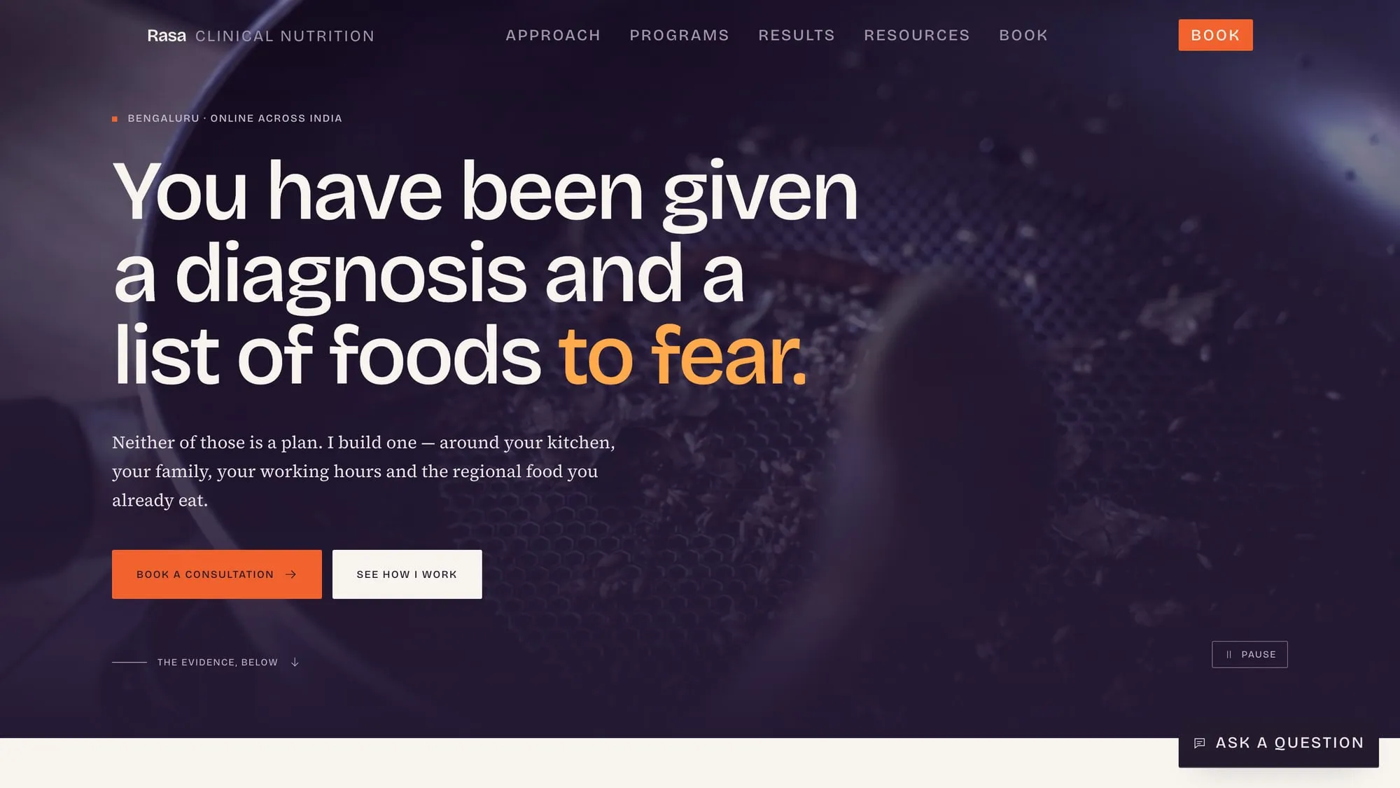
Open the live siteReal, working, and yours to poke at
Services
- Positioning
- Design
- Build
- Copy
- Booking flow
The problem
Health practitioners get offered two templates. One is the clinic brochure — stock stethoscopes, a mission statement, no prices. The other is the wellness landing page — before-and-afters, urgency timers, and a tone that makes a qualified dietitian sound like an influencer. Neither works on the person who actually converts here: someone diagnosed a fortnight ago, frightened, and already sick of being sold to.
What we did
- 01
Led with the practitioner’s reasoning rather than her credentials. The headline names the reader’s situation before it names the service.
- 02
Published the prices. A ₹3,500 consultation, credited against a programme if they enrol within thirty days — stated on the page, not withheld until a call.
- 03
Split the six conditions into their own routes, so someone searching for PCOS lands on PCOS instead of a generic homepage.
- 04
Put outcomes on the page with real markers attached, and no photographs of anyone’s body.
- 05
Reduced booking to one decision: a single consultation, with the programme choice deferred until after she has actually seen your bloodwork.
Outcome
Someone can arrive frightened, understand what is being offered and what it costs, and book — without speaking to anyone or being sold at once.
- Conditions, each its own route
- 6
- Cumulative layout shift
- 0
- Decision to book
- 1